
The Quiet Power of Solid Colors in Interior Design
2026-04-24
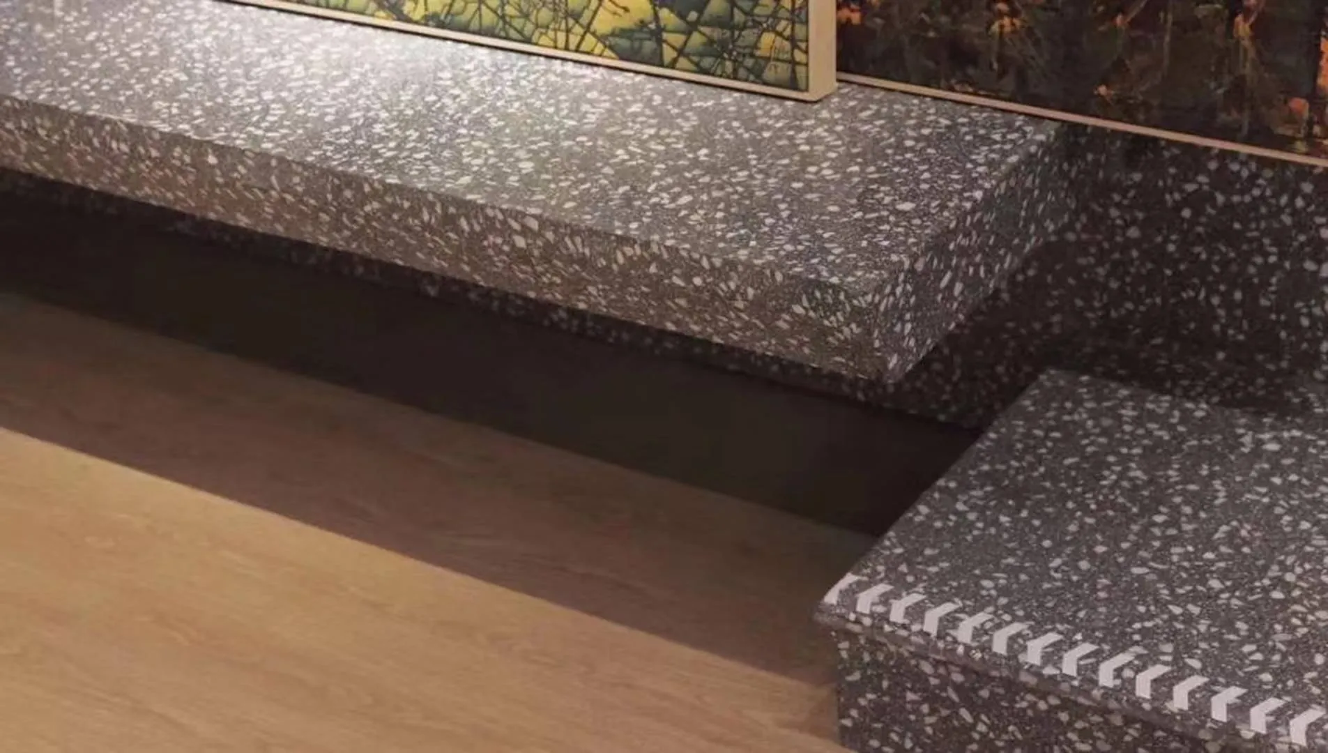
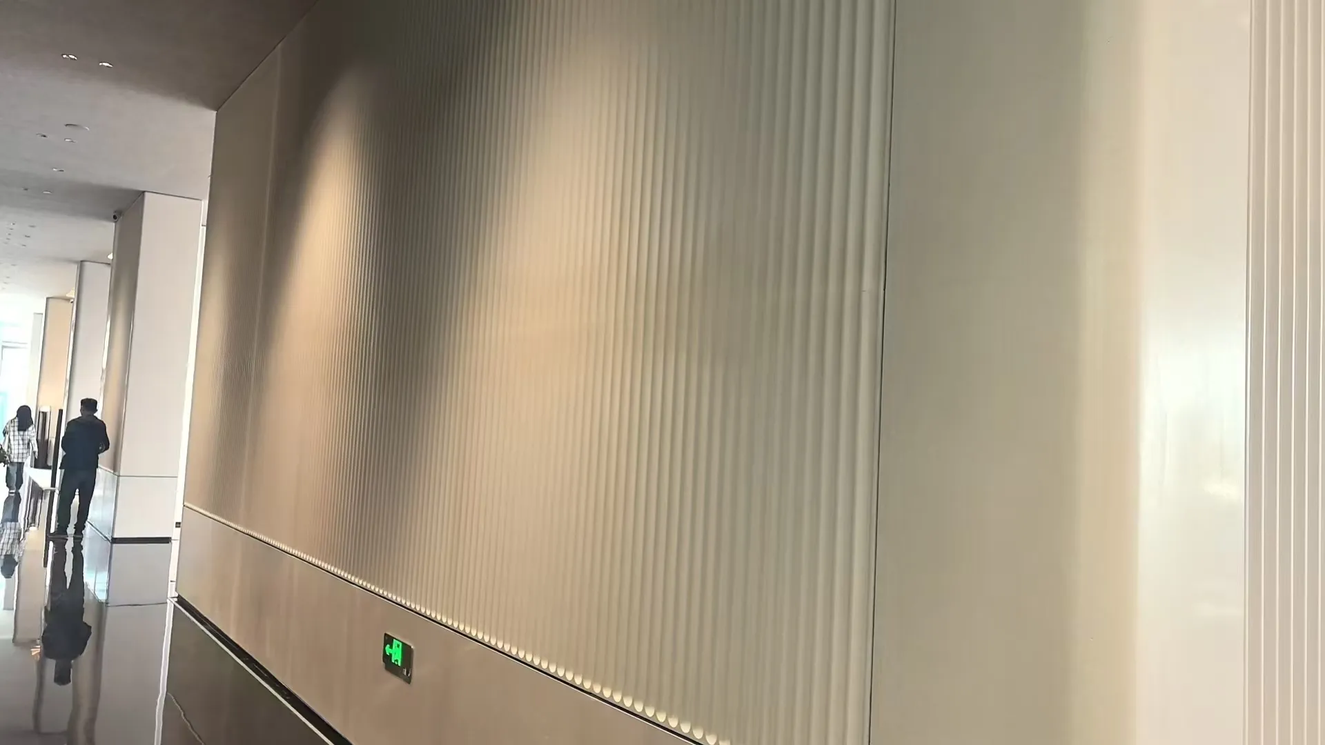
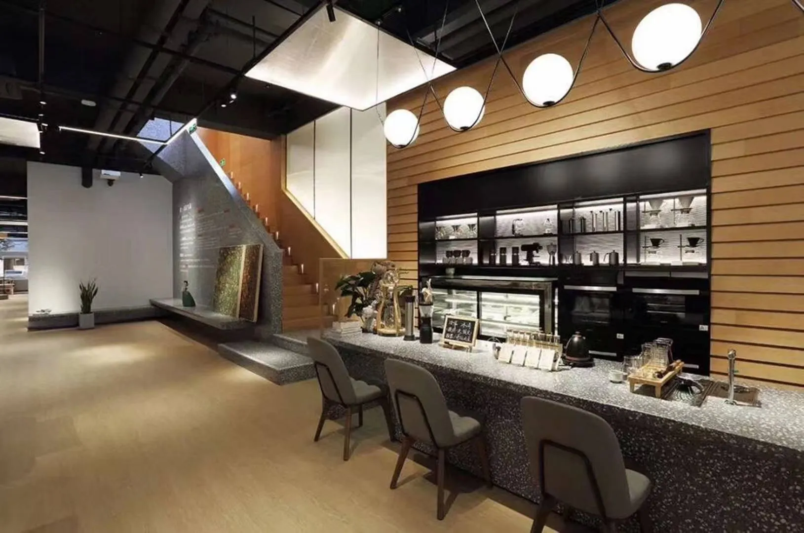
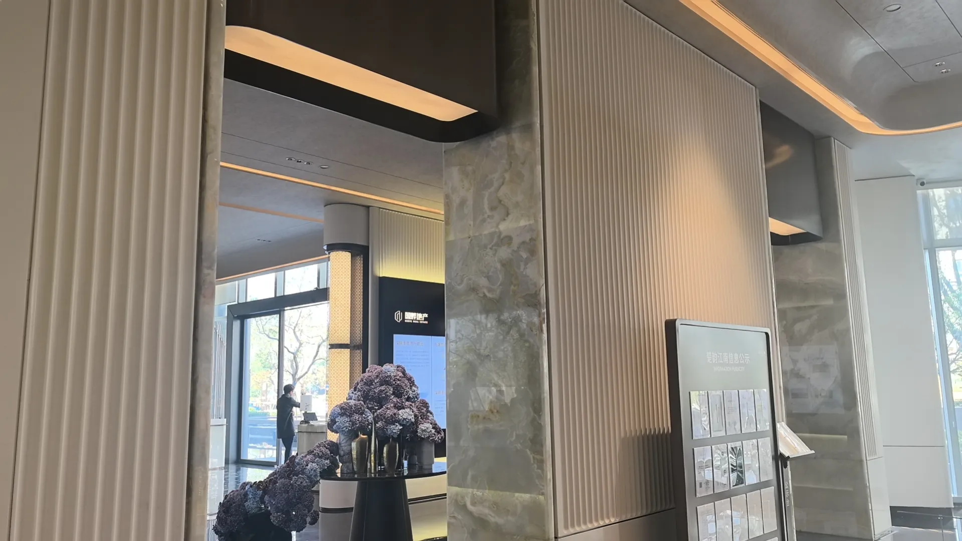
In a world often saturated with visual stimuli, the choice of color palette in interior design serves as a foundational statement. Among various trends, the use of solid colors—or monochromatic schemes—has emerged as a sophisticated approach to creating serene, timeless, and deeply personal spaces. This design philosophy emphasizes simplicity, coherence, and the subtle interplay of light and texture over complex patterns or vibrant multicolor mixes.
The terminology around this style varies, often described as "solid color minimalist," "monochrome simplicity," or "plain solid style."
While commonly associated with fashion, these terms translate seamlessly to interior design. They refer to a conscious selection of a single hue or a tightly related family of tones (such as varying shades of gray, beige, or ivory) as the dominant theme for a room or an entire home. This is not merely an absence of color but a focused celebration of its nuanced potential.
The impact of color on mood and perception is well-documented. Solid color schemes leverage this influence deliberately. Calm colors like soft blues, serene greens, or pure whites can foster tranquility and a sense of spaciousness.
Warm, solid tones such as oatmeal or light taupe can instill comfort and warmth without overwhelming stimulation.
The key lies in avoiding large areas of intensely stimulating colors like bright red or pure orange, which can lead to visual fatigue or agitation, and instead using them sparingly as strategic accents.
A monochromatic environment reduces visual clutter, allowing the mind to rest and focus. It creates a backdrop that feels intentionally curated, clean, and elegant.